20th Anniversary of Painting Sex, Drugs and Trance & Roll
A Long Introduction
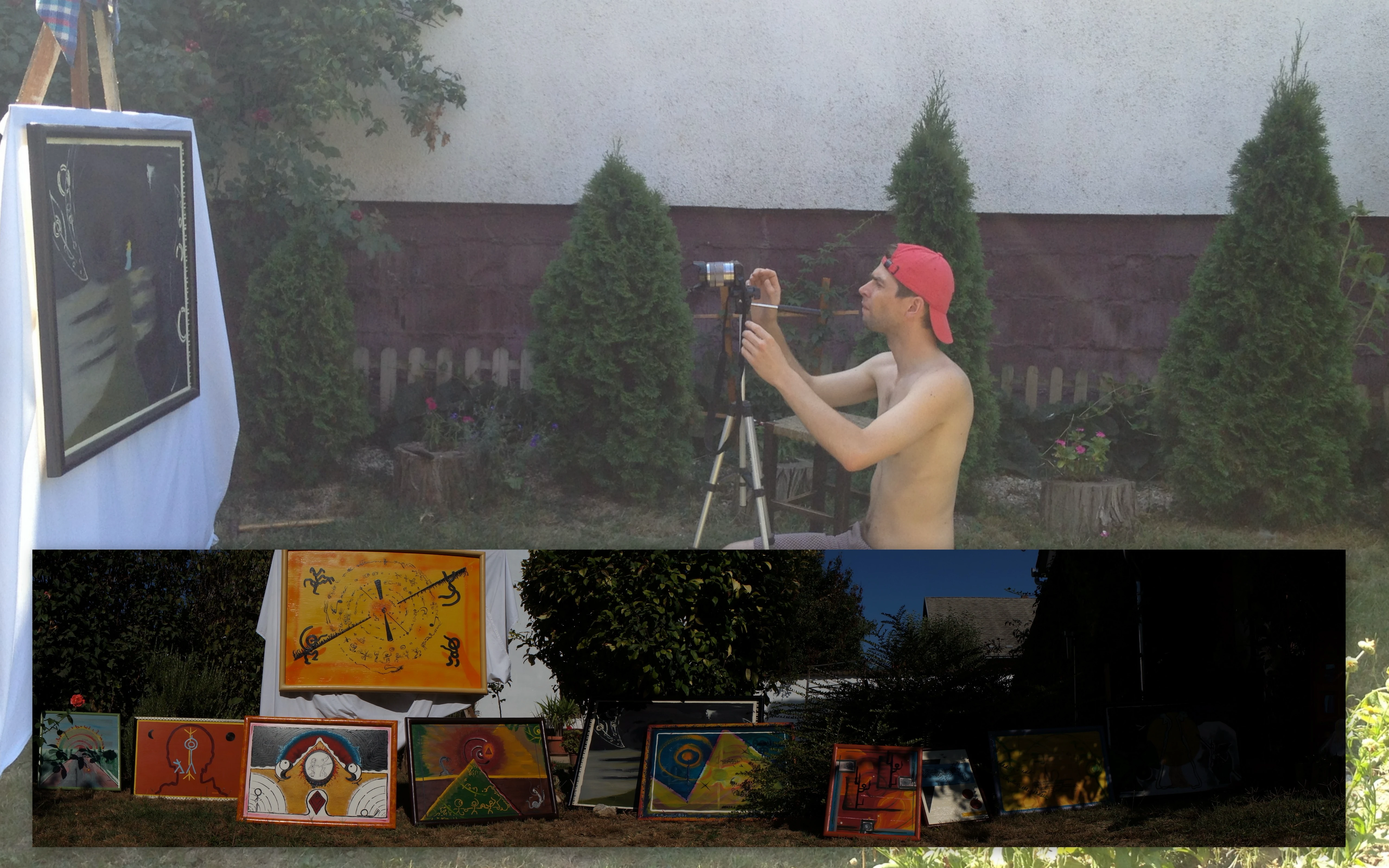
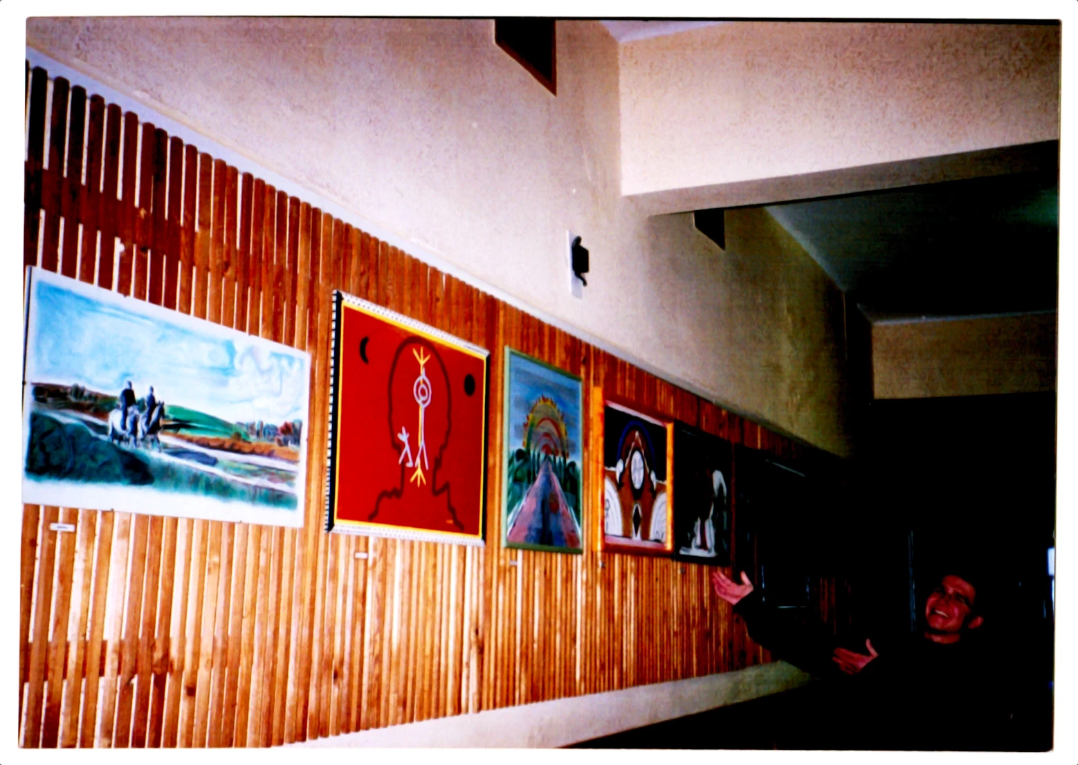
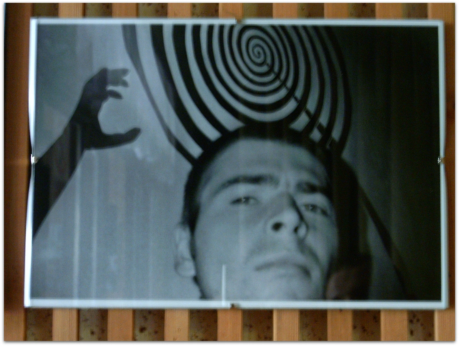
It’s March 2025, and I’m still in England. It’s been almost 20 years since I arrived, and guess what! I planned to stay here for only one year, make loads of money and move back to Hungary. Move back to Hungary to do what? Well, I don’t remember, but I guess I didn’t know then either. Maybe the idea was that once I had the money, I could do a few more years of soul searching without working for people I didn’t want to. But I didn’t make loads of money, so I stayed. Also, just look at my serious face in the photo below that I hung next to the exhibition — I was fed up and maybe didn’t even want to go back.
I’ve always enjoyed drawing. I used to doodle in my schoolbooks, and people would say, “It’s cool! But I don’t get it.” There was an older boy in the village who, at the time, was THE ARTIST in my eyes. His work was exhibited in the nearest town too; I believe he even won an award. So yes, probably the most famous person I knew. His artwork was often non-figurative, abstract, and unusually cool. He was only a couple of years older than me, and I remember considering him something like a big brother — a leader to follow and learn from.
It’s interesting writing about the past. I always tell people that I don’t remember my childhood, but now, as I try to recall why I started painting, a lot suddenly comes back to me. Maybe it’s true; everything is backed up in a data center.
So you’ve read a few paragraphs, and I still haven’t shared much about my paintings, right? We’ll get there. Don’t worry. Understanding me better will help you understand my images and what I’m doing here today. At the end of the day, I was painting partly to express myself and partly to impress others. Now, with writing publicly on this website, it’s exactly the same. It’s about both of us. This is what Justin Welsh wrote a few weeks ago in his newsletter: “I’m kind of teaching myself through a public journal.” Justin is somewhat like Seth Godin — an entrepreneur, a well-spoken marketing guru — and this specific sentence makes me believe more in what I do here on this website.
Shall we dive in?
The Good (Enough)
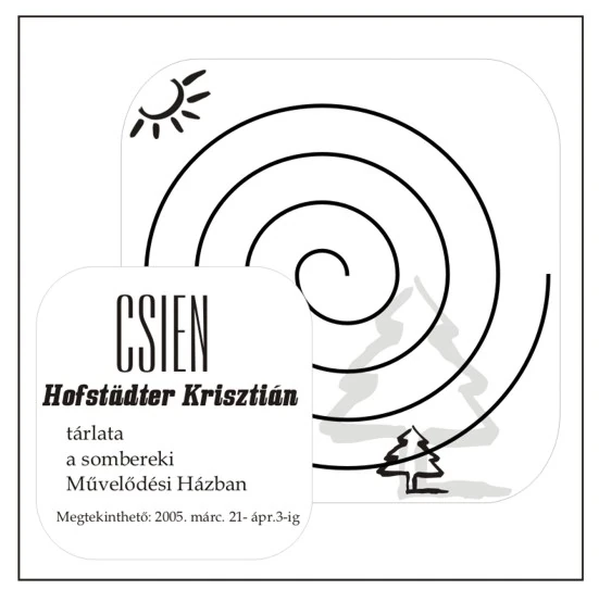
The exhibition’s title Csien is the Hungarian name for hexagram 53 (䷴) in the I Ching book by Müller (2001). This hexagram is more often referred to as ‘chien’ (with an ‘h’) in English. The Chinese character for this word is 漸, with the pinyin ‘jiàn’. In essence, it represents gradual progress, a guiding principle that has been useful in my life since I consulted this sign.
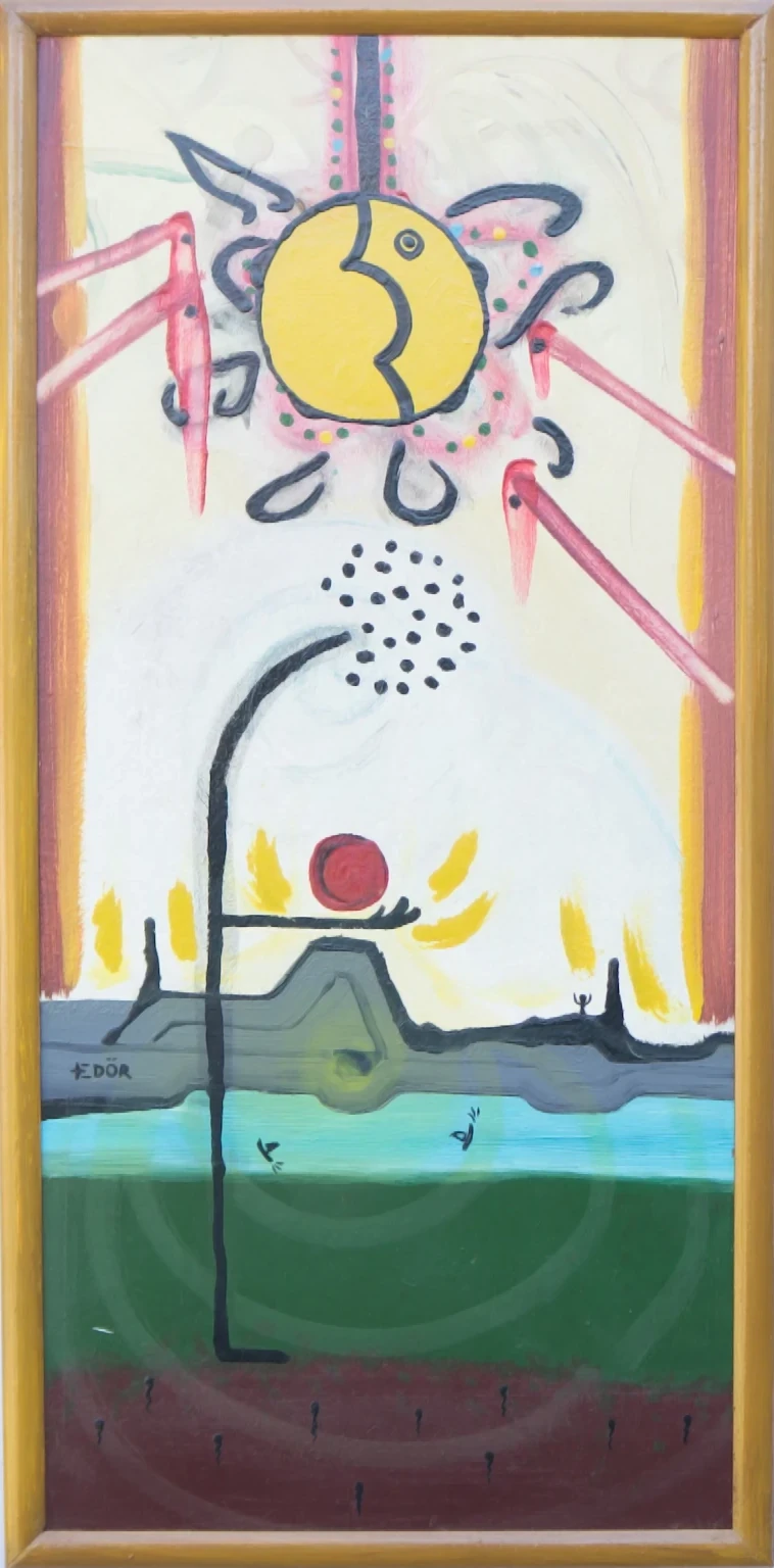
Look at the poster and notice how the sun in the top left nourishes the small tree’s dream of growing into something big one day. Did I unconsciously want to bring my shadow into the light and illuminate what was suppressed? One must be careful when seeking meaning in 20-year-old archives.
The painting below is one of my last ones, possibly even the final one for this exhibition, and is among my favorites. It shares its title with the exhibition, perhaps because it serves as a summary of everything I’ve learned while painting over several months.
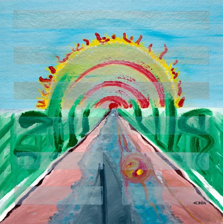
Chien is a painting that I initially designed on paper. I knew exactly what core structure I wanted, including where the river and the sun should connect and how much space the hexagram should occupy. Out of all the paintings in this series, it feels the most harmonic and positive. It’s almost like a mantra: “Trust the process.” I have reused the image several times, once for the cover art of my Secret Place music release in 2013.
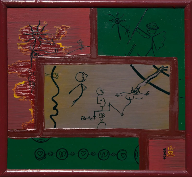
The next painting is one of my first ones. I think I made it around November 2004. (I only painted for a couple of months.) Its original title was Exorcism, and I remember the purple paint for the middle character came from some kind of berries found in a nearby small forest, known for its old graves between our house and granddad’s vineyard. The color was much redder when I first applied it; it has faded over the years.
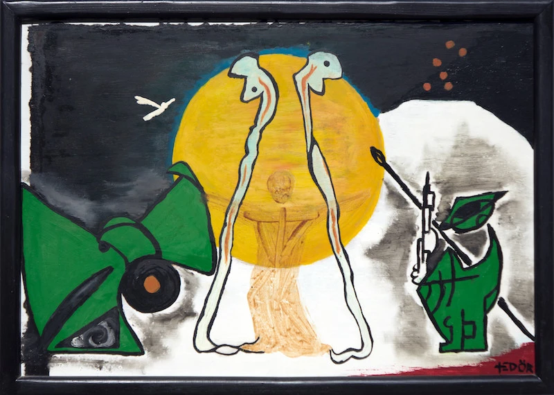
I remember the initial concept was something like dark and light triangles sharing space with a large orange circle, which might be the massive gloria of the figure in the center. I must have compared this figure to Jesus because when I look at my digital archives on an old hard drive, the English title of the painting is Crucify. Why did I change the title after a few years? I am not sure. Maybe I was simply experimenting as if the title were a keyword or metadata for a YouTube video — changing it with the hope of gaining more attention. But today, the painting gets its original title back! EXORCISM! Perhaps I changed the title to Crucify because I felt more like a victim than a warrior. Maybe when I painted it, I felt strong, and when I renamed it, I felt weak. I mean, look! The figure has two massive snakes. Or she, or they… an asexual angel? So no, we are not looking at a victim (anymore). Today, he is a warrior or at least that’s what I want him to believe.
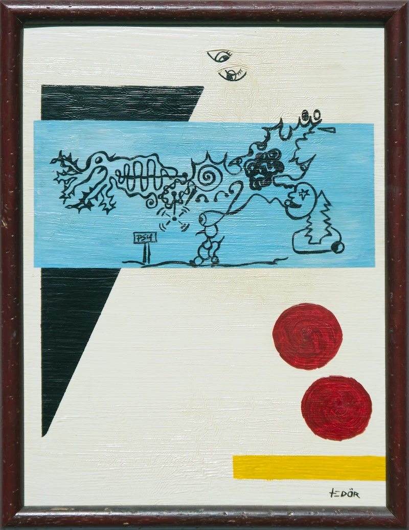
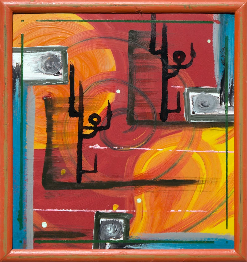
Below we have another one of my favorites. When you look at the drawing in the blue rectangle, on top of the pine tree you see a face swallowing something. A psychedelic substance? Just look at the thoughts that come out of the journeyer’s head. Also, whose eyes are looking down from above? Observers, guides or mine?
The painting below was one of the first paintings I made. It was a present for a friend but has found its way back to me from his dad’s loft. It’s one where I also experimented, even on the frame. There are layers and layers painted over each other. Who knows what’s lurking at the bottom? Besides the many eyes and large triangles, we see some text saying “If you have eyes, see!” The painting is trying to suggest keeping an eye out for answers, looking beyond the obvious.
The painting below, again, is one of my favorites. How many favorites can I have? It’s small, probably around 50 x 50 cm, and is titled Gap. I could say that it represents traveling through an intergalactic portal (a gap) linking universes, but actually, the title comes from a small hole (an accidental indentation) in the pressed wood. It’s just under the top frame, a couple of centimeters right from the center. A gap in a gap.
Like the other paintings I still have at my parents’ house, I wonder how often they look at this? Could it help them escape their ordinary realities? It did for me. And no, I don’t think they look at them the way I do. They’ve got TVs.
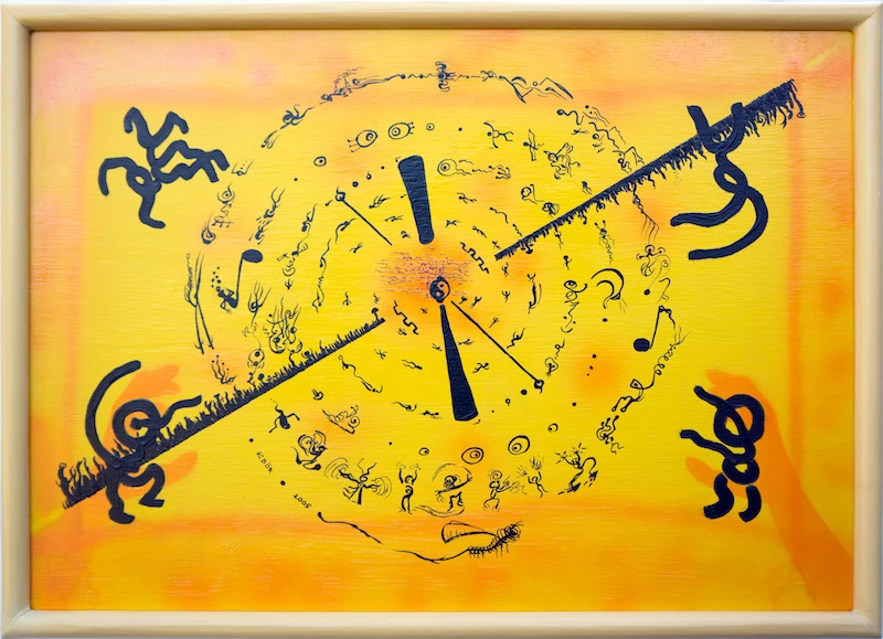
The next one took a long time to finish. I was trying to use the Jin & Jang and spiral shapes again to convey how people transform themselves while dancing at a goa (psy) trance festival… on a sunny day at Ozora? Yes, exactly there! You can check this yourself: Don’t we look a tiny bit transformed in the photo below the painting?

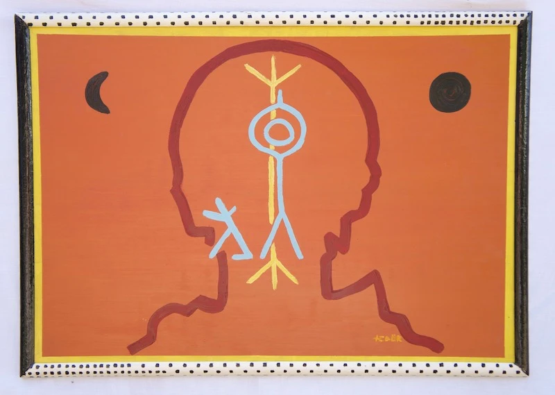
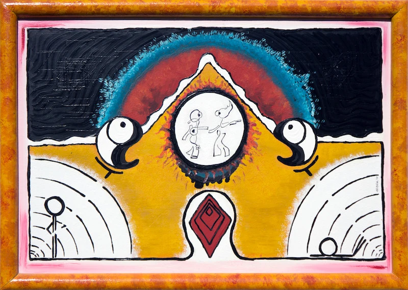
The next painting is another one of those pre-designed creations where I am sure I made drafts on paper first. It has an Egyptian vibe due to the pyramids and might even look somewhat religious or conspiratorial because of the burning red triangle in the middle.
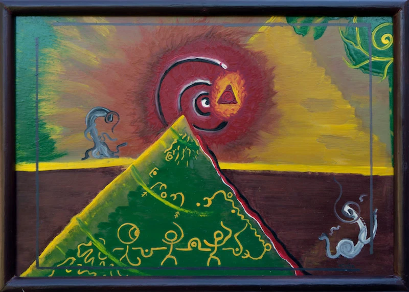
We can see three spirals: one in the center that I can’t decide whether it’s moving inwards or outwards, another in the small red triangle mentioned earlier and one in the top right corner where there is a green mummy face looking down at the ‘feeding’ as if uninvited to the party. The Tao (Jin and Jang) is present again with two alien creatures: a dark one on the left and a light one on the right, perhaps supervising the feeding. I’m starting to wonder if I’ve overdone anthropomorphizing. Even the yellow pyramid has a face. I like this painting. It’s the one I gave to my grandmother whose husband died when I was little. Whenever I visit her, I spend some time in the room where it’s hung. It’s almost like a ‘clean room’ that many peasants used to have in our area. Tidy but also lonely. In her main room, where she sleeps, reads, and sometimes watches TV, there are religious images and family photos on the wall. What could my painting mean to her? Could she secretly be afraid of it? Maybe it doesn’t look Catholic enough. I will ask her.
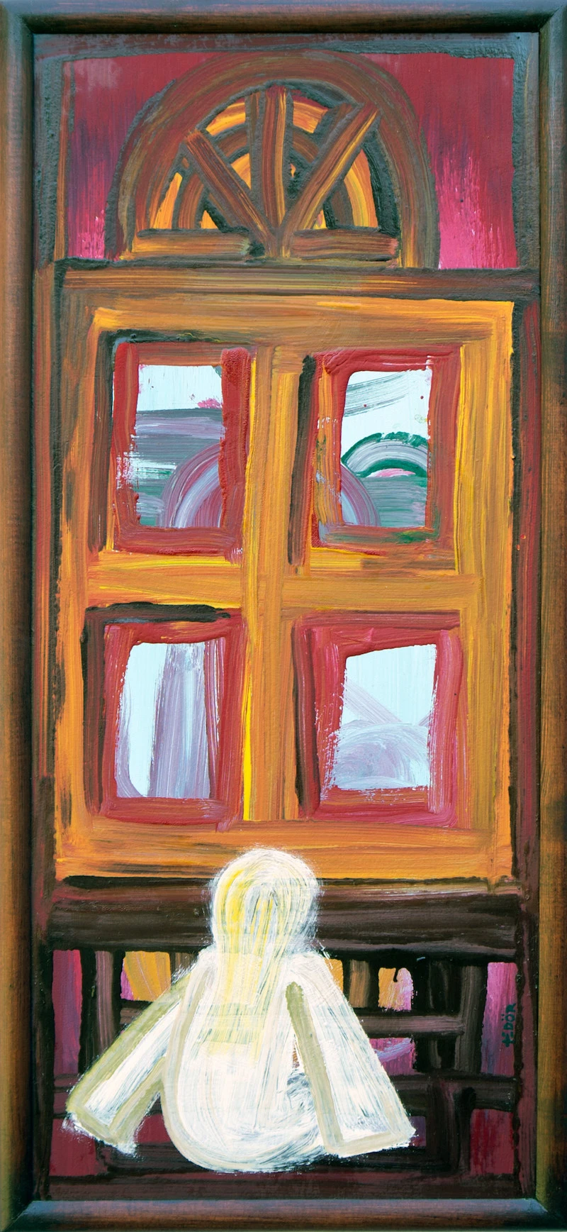
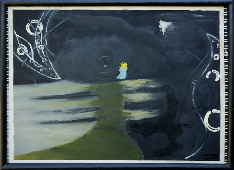
The next one is titled Insomnia with a young girl looking through a big window. The idea here again is that what she sees on the other side is another world, perhaps a non-ordinary reality. Some people told me it’s unsettling. Is it because the girl sitting looks a bit like a ghost?
OK, the next painting has an interesting story: a boy becomes a robot, someone following orders. He’s manipulated by a witch, poisoned by her love potion. When did I paint this? Before my first real long-term girlfriend or while we were getting to know each other? Well, the witch wasn’t her, of course. I was referring to other girls who string you along for months making you believe that maybe one day you’ll step up from a salivating dog to a salivating boyfriend. YOU KNOW WHO YOU ARE!
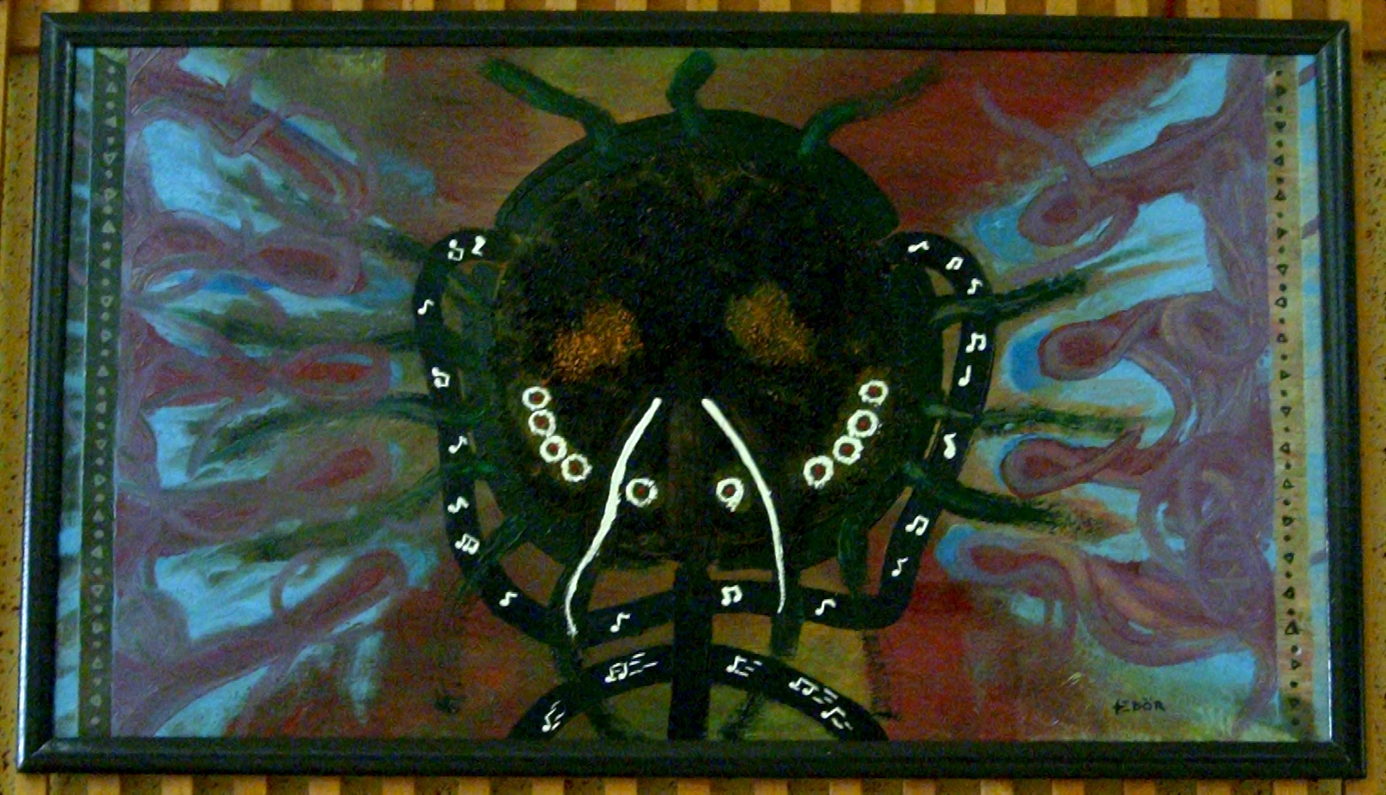
Okay, back to good times with the next painting: Music. This was a present for a good friend who, after many years and moving places, still hangs it in his living room. Well, maybe it’s a better painting than the one I gave to my other friends. So no hard feelings, guys!
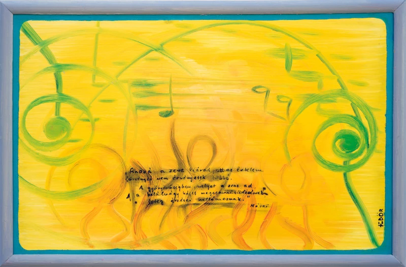
The text in the middle is a quote by Sándor Márai. The English translation sounds something like this:
Where music flows, the laws of reason no longer apply. In the beauty that music gives, the sick emotions of death’s lustful destruction ripple.
Did I really feel like dying when listening to music? Suicide has never been something I seriously considered, so it must be the state of mind some music can induce and maintain that I (and perhaps the quote too) were referring to. An otherworldly feeling of an unusual oneness.
The next painting is big. I only painted two A0-sized frames: Goa and this one, which might be the first in this series. Are we again looking at someone trying to escape reality? The character with her back towards us is Dorothy from Kansas. But where is she going? If she’s walking on the yellow brick road, she might actually be returning to Kansas rather than leaving it.
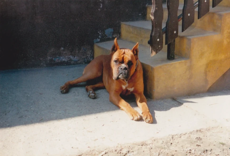
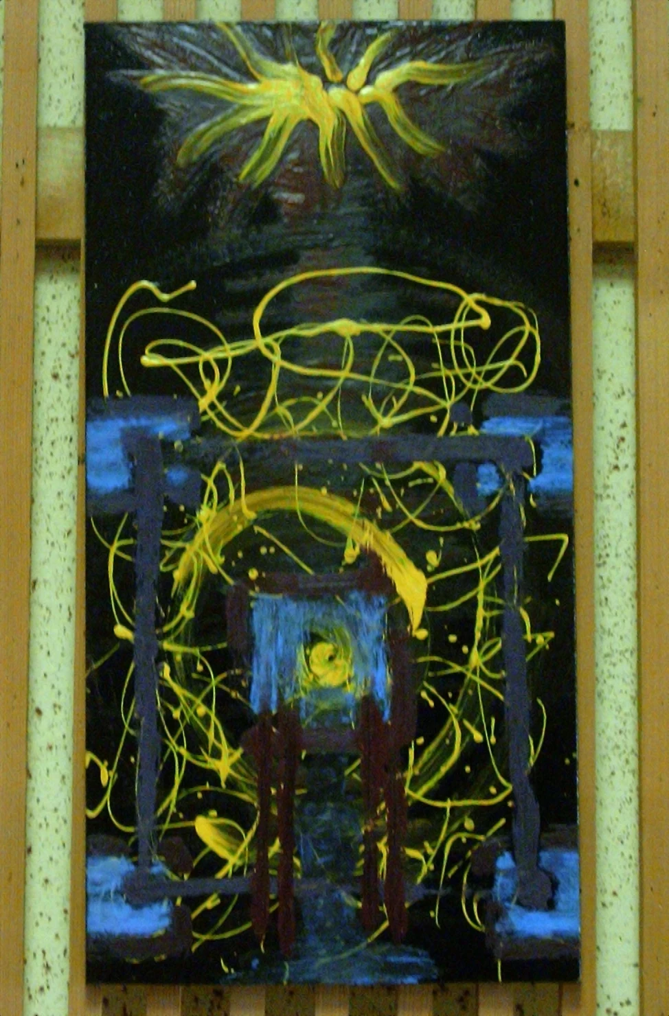
The painting below is another experiment I’m still very happy with. It is Prayer. It was painted after my dog died that year. The long yellow shape behind the barking dog and the praying character represents a shaman tree, an imaginary tool through which shamans travel to the upper and lower worlds. These shapes emerged without much prior planning. I am in the cellar, the same room where he passed away earlier. The painting room. I want to reconnect and tell you again how sorry I am for not being always nice. I want to tell you that you should have gotten more attention from us and that I am sorry for not being able to rescue you from your chains. So I open the gate by painting the silhouette of my head and shoulders, climb the tree to meet and talk to you so you don’t forget that one day we will be together again. We are happy in this dream.
Wipe your tears and come back now.
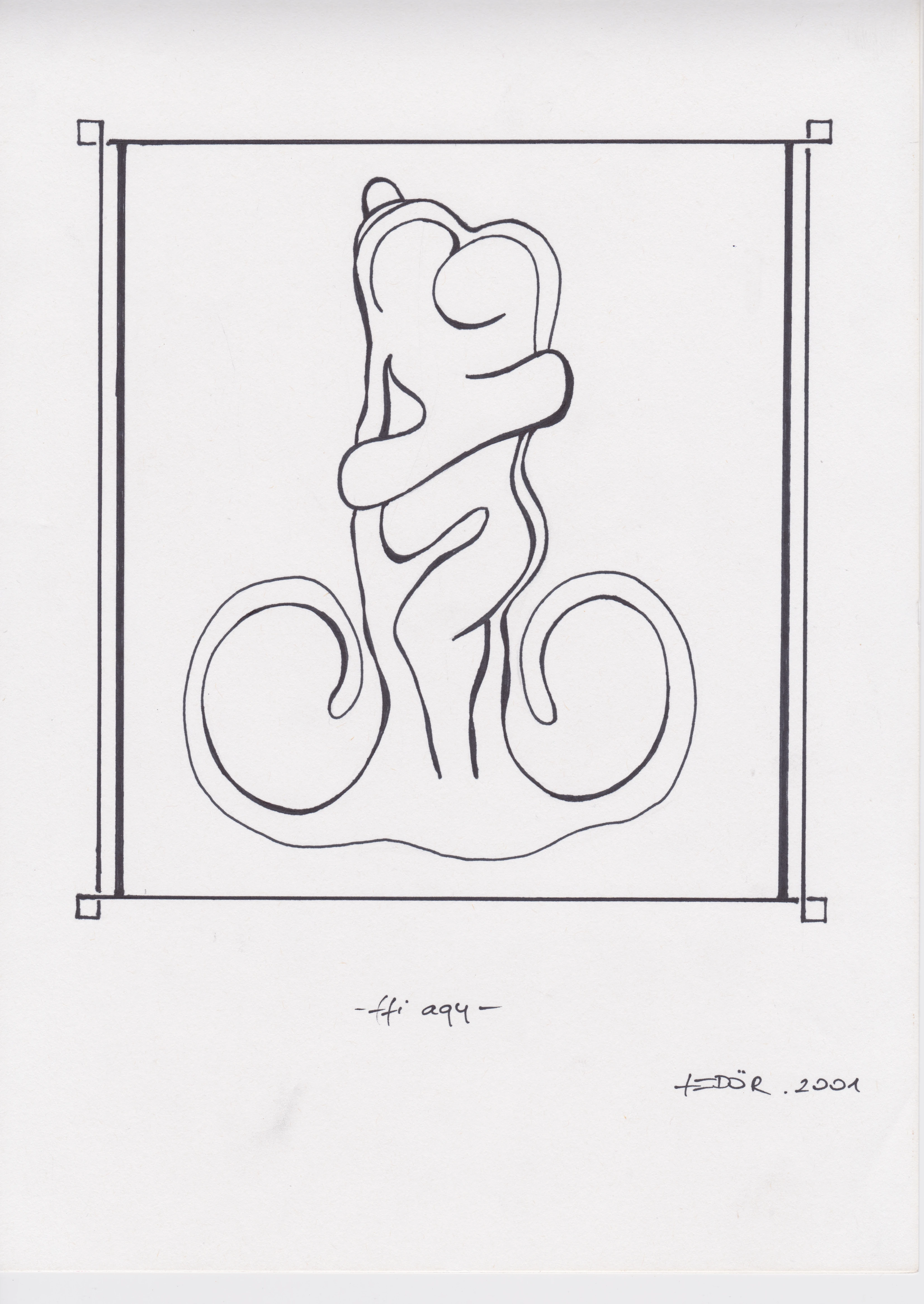
The next one… Well, the title is Hug. It’s a tricky one.
Can you see the boy and girl in the middle? Where are they going? What are they planning to do? They seem to be in love. Perhaps they were, for a while.
Can you imagine your daughter receiving a painting like this from her new boyfriend? It’s interesting. I seem to have gotten on quite well with all my in-laws, sometimes even better than with their daughters!
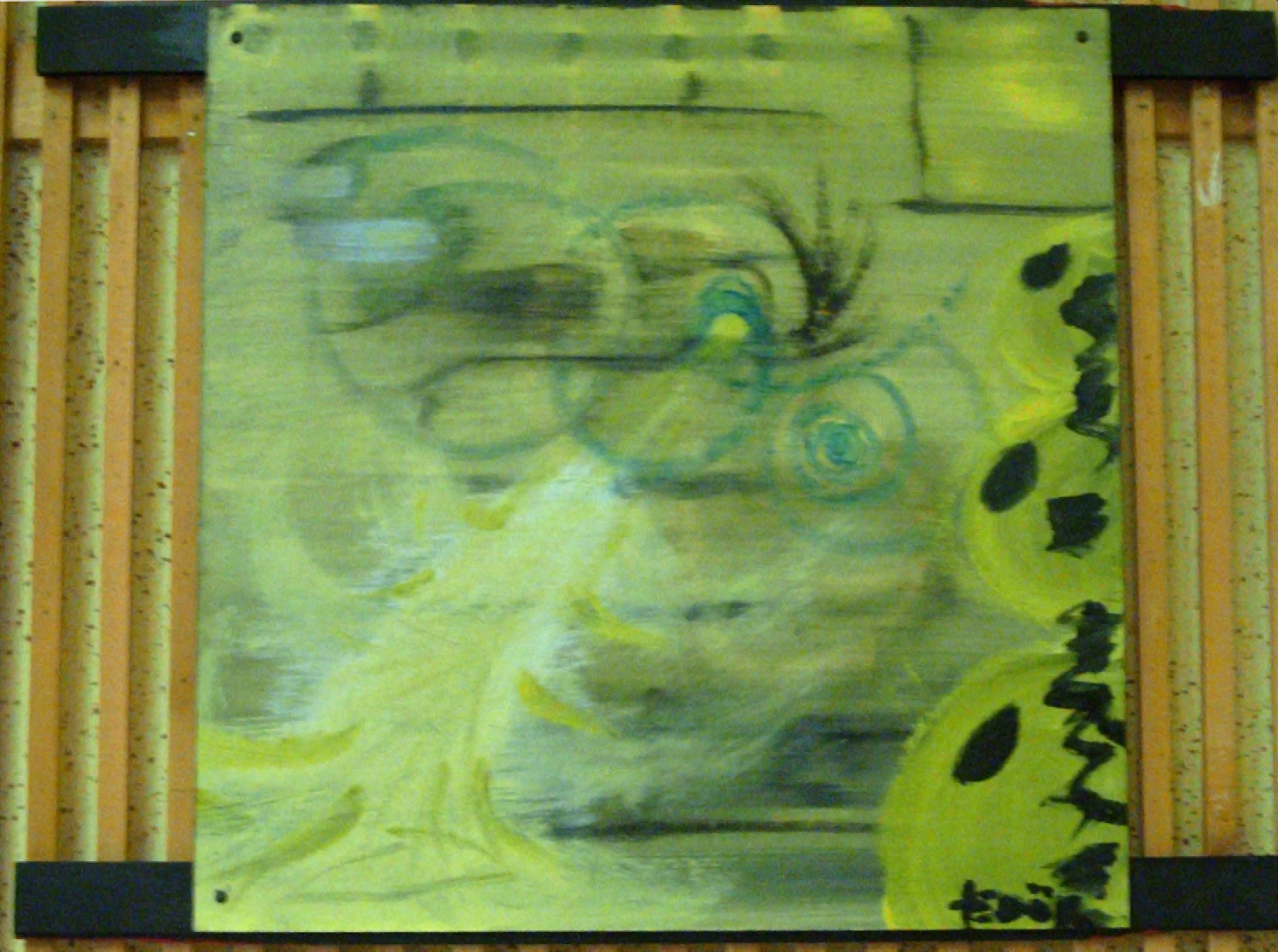
The one below is titled Spring Feeders and has been with my father’s mother. This was another experiment, which I’ve mentioned before. When I say ‘experiment’, it doesn’t mean academic research with extensive planning beforehand. Instead, here with this painting I started by drawing a few shapes, and the rest followed. Nowadays, people might refer to this process as emergence. They ask, “Shapes! What do you want to be surrounded by? What meaning do you want to carry?” It’s fascinating how sometimes you have a specific concept or message in mind for your work, while other times the initial concept is to experiment with a color, a shape or something else to allow for messages to be discovered during the creative process. I suppose it was still quite cold when I painted this, so perhaps it represents some kind of ritual. A symbolic offering or sacrifice where the God of Warmth is being fed by a dandelion.
There were more that made it to exhibitions. Some I no longer have, while others might not seem worth including here. Or perhaps they are? When recounting an experience, should we only highlight the very best and chuck out the mediocre, half-baked and failed ideas? It depends (a great answer to many questions). In academic papers, there is often a section detailing challenges or limitations. Things that didn’t work out or didn’t have time left for. When you read a book, fiction or non-fiction, you hear about what didn’t work out too. I mean, that is what drives the story, right? The ups and downs.
So, I’ll continue with what didn’t work out.
The Lost and Less Good
Looking at some of the images listed above, I still like them all except for Love Potion and Spring Feeders. Perhaps I made these two under time pressure or they were experiments without much planning or luck. But maybe, after writing about them now, I do like them… a bit more. Can my analytical mind make me like them more?
So, you can stop reading here if you like, as the following images aren’t quite my best work. But will my writing about them be good? People display all sorts of things in galleries, ranging from toilets to junk, and then write and talk about them. That’s conceptual art. Some of it is good.
So you are still here. Okay. The next one is gone. I gave it away as a present to a colleague I worked with as a trainee insurance agent. Let me not disclose what was on my mind when painting it, nor its title.
Let’s play a bit. Just take a look and guess what it might mean. (I’ll reveal my thoughts below the photo.)
Ready? Spoiler alert!
Its title is a date: one, nine, three, and nine. The color combination of green and black, along with the clockwise shifting thin black wood slabs on the sides, should convey the brainwashing done by the Nazis during World War II. I don’t know where this painting is now. Is it hanging on a wall or in the trash? It’s certainly not one I’d like to display for positive energy in my house. But perhaps it could be placed here in the study on the wall behind me.
However, if we disregard what the title signifies, the color combination and spiraling motion might not project evil on their own after all. Nor should the swastika, considering its long history, with earliest known appearances dating back thousands of years BC.
So, what did you think before I explained my connection to history with it? Did your thoughts overlap in any way with mine?
Next one. Below is another experiment that didn’t quite work out: a bug-like figure playing music for some elusive dancers. At least the bug is smiling! We can’t say it’s particularly creepy or is it? I know whose old childhood bedroom has this painting and perhaps it’s OK that no one has seen it for 20 years.
The painting below, I believe, was given to my other ex-colleague at the insurance company. I miss this painting! The title is Don Juan, and the head in the middle probably belongs to a combination of fictional characters with the same name; one in Seville (the Casanova type), the other in Sonora (the shaman type). The latter is probably the kinder one.
Did I want to have skills to seduce women? Which young man doesn’t? Looking at Don Juan on the painting now, the hairlike shapes standing upright above his left ear remind me of my father’s father. I am almost sure he was a seducer too. Very handsome and flirtatious. How did my grandma survive his attitude? Do I dare ask her about the past?
Next is something I probably made in a couple of hours. Initially, I thought it was another example of work not worth mentioning, but then the title reminded me of the ideas I was trying to embed in it. The Hungarian title, Fél-be/tép, plays with words. ‘Fél’ can mean two things: ‘half’ and ‘to be afraid of.’ I guess the feeling I had was both: being afraid and divided. (‘Tép’ means both to tear something apart and is slang for smoking weed or drinking alcohol.)
Yes, I was becoming more and more stressed under the influence of cannabis, and yes, I was divided. I wanted to change but could not. It’s not that I was smoking weed day and night; I wasn’t, and I don’t think I ever really craved it. It was more like something that went naturally with the other things we were doing; going out, drinking a few beers, and smoking a joint. This divide caused further distress, which might be represented by the yellow lines chaotically swirling around, like the thoughts I sometimes had when being high, or low? The title is also linked to the film Half Baked (1998) starring Dave Chappelle. I remember us laughing our brains out watching it. Re-watching it today might be different.
Another reason why I think it’s fine to add mediocre or even your worst works to your website… sorry, I mean my website… you might not want to risk this. He-he. Well, you got this far so I might be getting better at entertaining…
So, where was I? Oh, I was about to justify why I think it’s a good idea to list works I’m not happy with. First, I worked on them; they were shipped (exhibited), so they are already part of the story. Second, while I am not famous (yet!), you should go into a museum and see how many not-so-good sketches or even framed paintings you can find by famous artists. They might be there because a venue couldn’t afford more famous works, but perhaps also because the audience should realize that not everything we do gets five stars. They are part of the gradual progress I mentioned earlier. They need to be made for us to learn.
OK, there are a few drawings left, and then we’re done here.
Drawings of Love and Hate
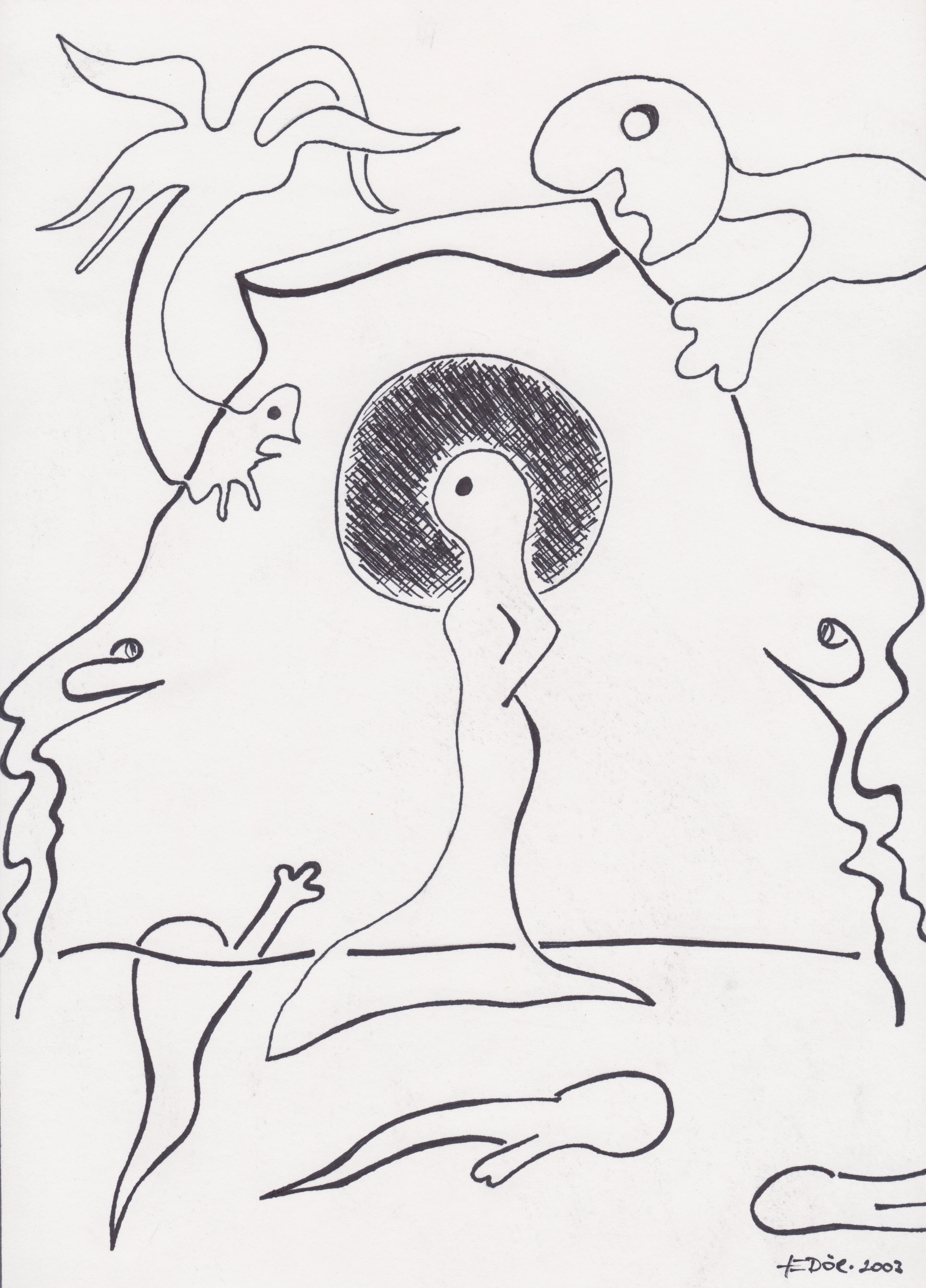
Most of these drawings are about sex and love. I wonder whether I had been listening to metal while painting. If so, I could have titled the exhibition Sex, Drugs and Rock and Roll instead of Chien. It’s more likely that I was listening to psytrance in 2004. CrAzY pEoPlE, cRaZy PeOpLe! Wait… shall we change the title to Almost Sex, Drugs and Rock and Roll?
Anyway. Back to sex (and love). If you look at the first three drawings below, what do you see? In the first one, you see me thinking about sex; in the second, about being in love; and in the third, about how the burning fire of witches seduces silly men.
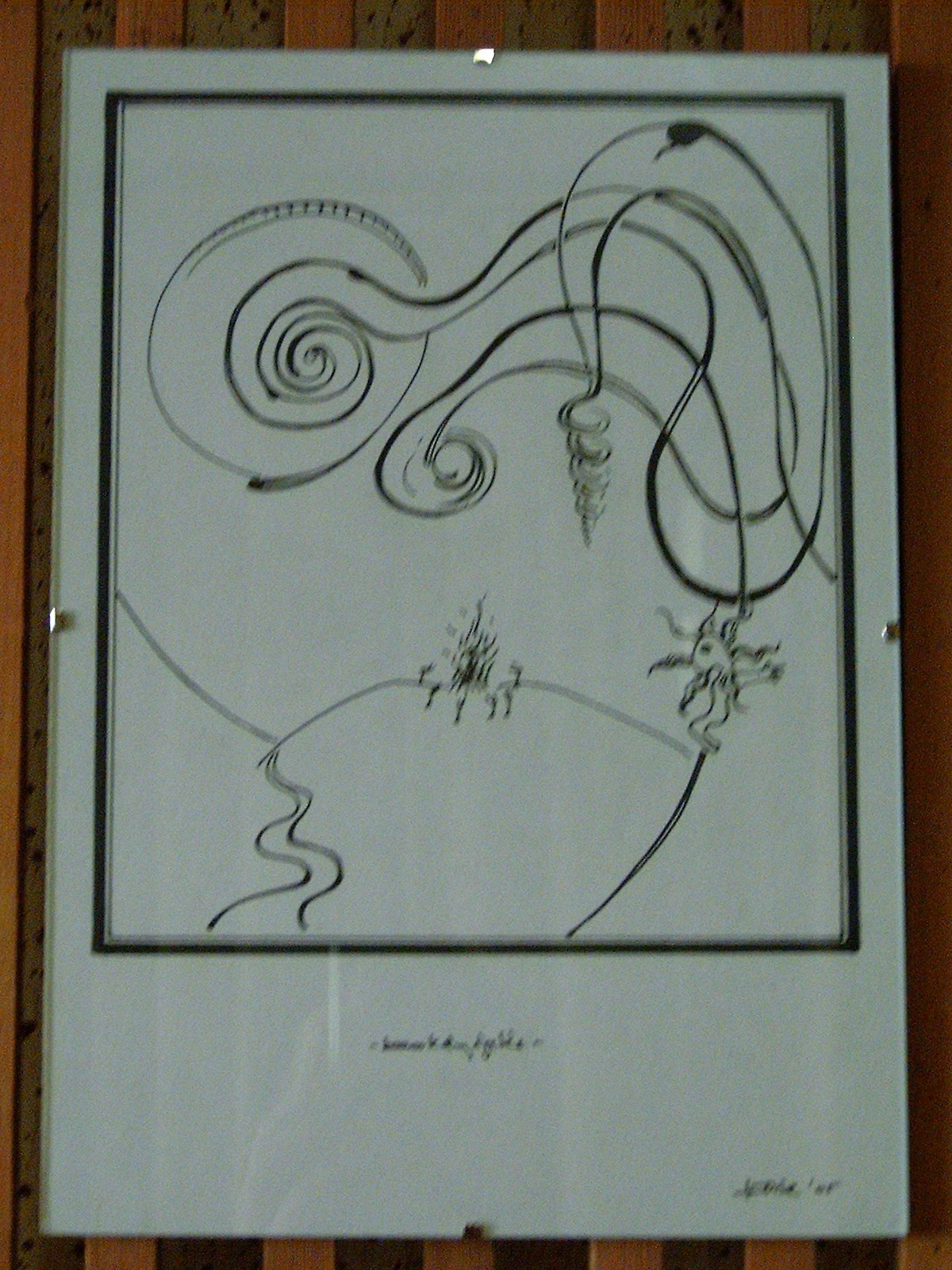
Then we have two more of these A4-sized drawings. The first one is an overcomplicated version of Saint-Exupéry’s Little Prince, where I tried to correct the frame’s unevenness by pulling it down with weights on the left and lifting it up with a triangle on the right. Is this a good example of digging myself deeper into a hole by not letting go, by trying to fix something unfixable? But maybe what’s important here is that I tried to fix it and learned that sometimes things can’t be fixed by adding more.
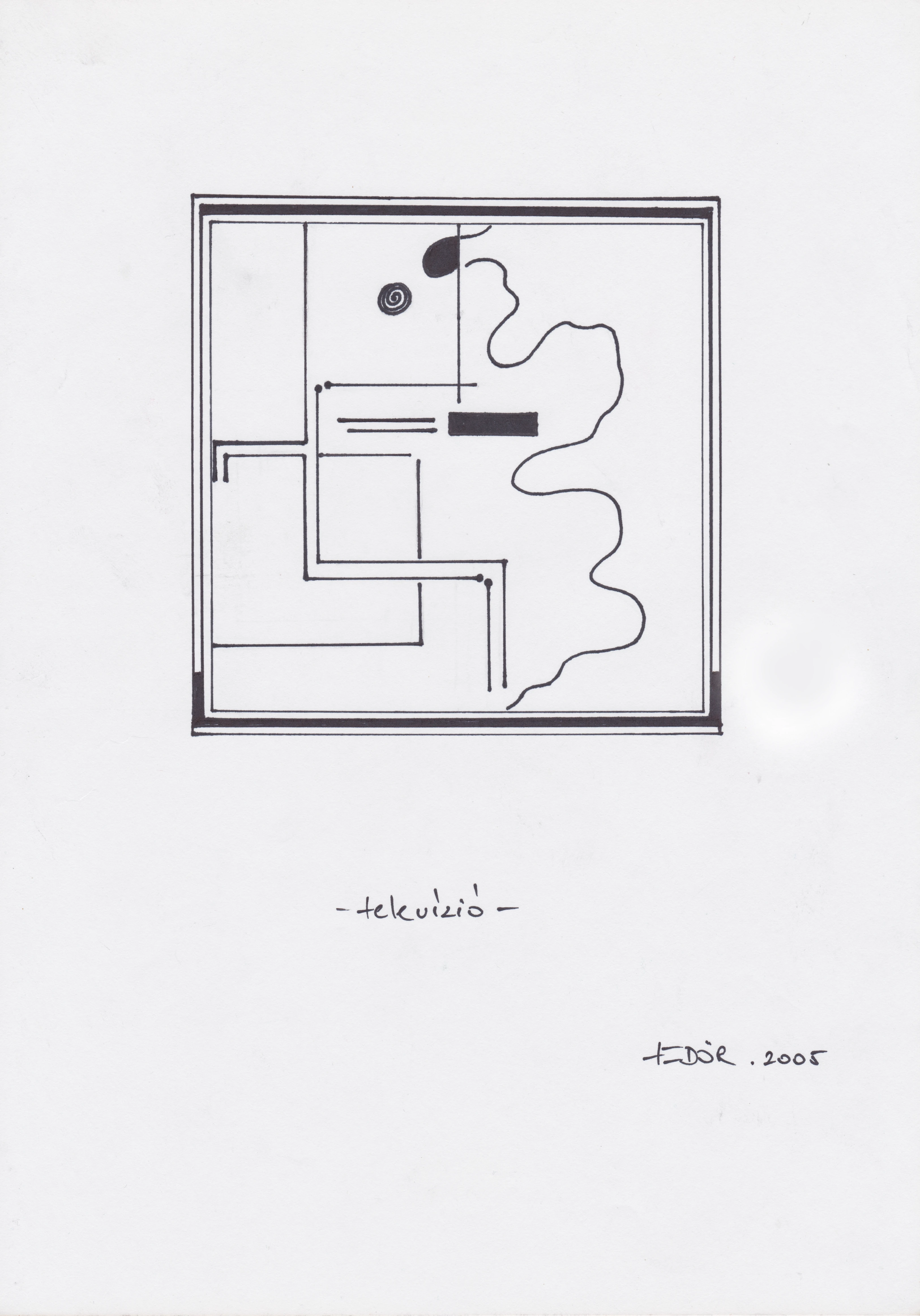
The next one is minimal, more balanced. It’s about people who, instead of trying to fix things, sit down to switch off by switching back and forth between cheap escapism and mainstream news. The right arm resting high on the sofa should convey their confidence in this lifestyle. Are they happier than the one who is trying to fix everything?
Last one: The source of all suffering. It’s about adultery.
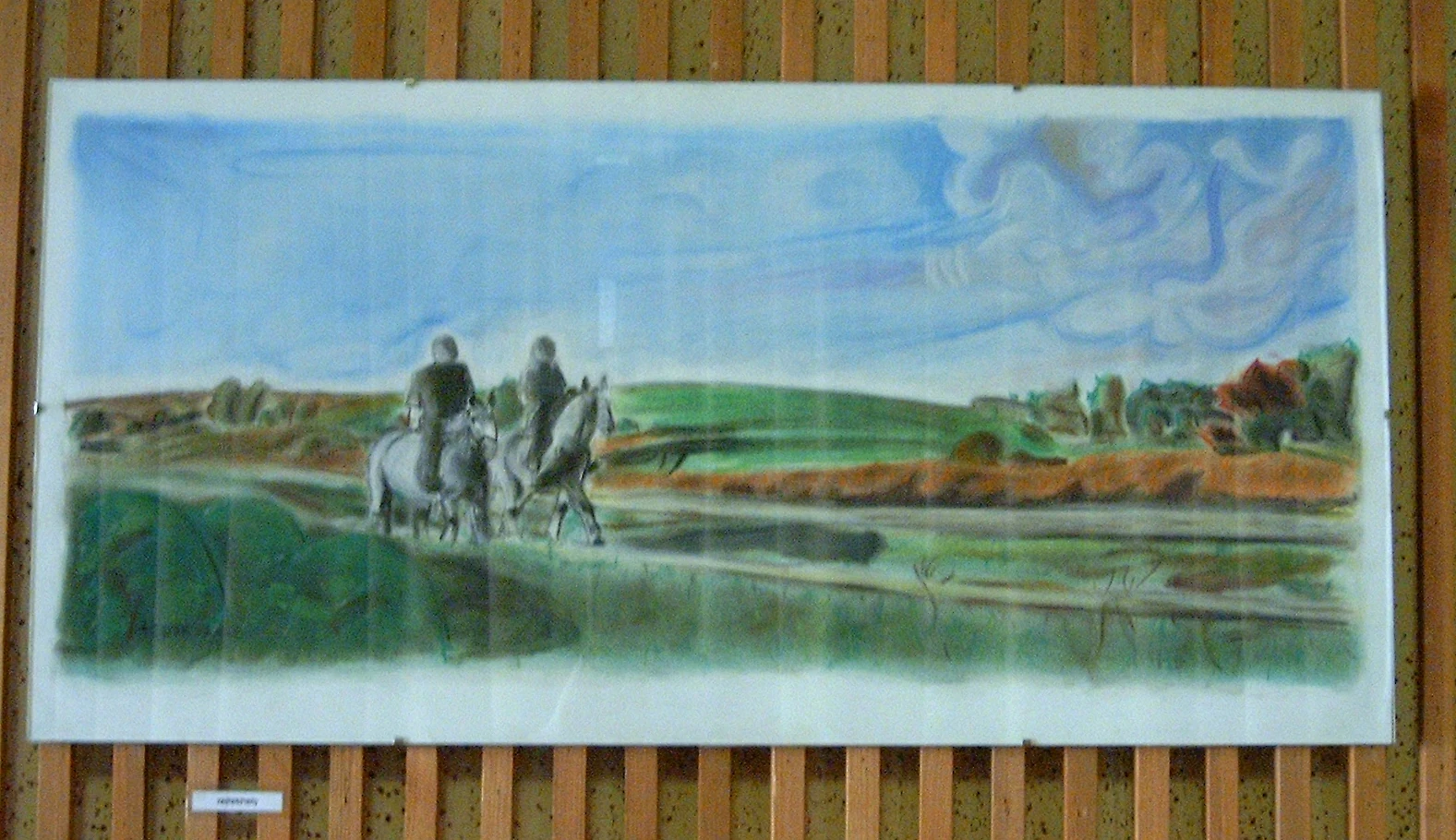
You can see the hideout as the fiery red bush in the woods on the right. Were the riders coming from there, or are they going there? It doesn’t matter. What matters is that we know they should not be together — or at least we know it’s not good for some people if they are together. Well, let me be even more specific: We know it’s not good for some people that everyone knows they’re together. Yes, they are in love, which you might say is beautiful and beyond their control. But that means we must accept fate even if it sustains suffering. Forgive but don’t forget?
Do you want me to reveal my role in this story? Would it be moral to unveil who is who in this painting? Probably not. I think I’ll twist names, alter the location, and write a big fat novel under a pseudonym. Or wait until everyone dies. You’d like that, wouldn’t you? You mean to write the story, not that everyone dies, right? Of course, I meant the novel! Sorry, rumbling again.
Whether suffering is caused by fate or choice, we need to flip the story around and look at it from all perspectives to help overcome the feeling of being a victim. We can do this as adults, but what’s often left for teenagers is turning up the volume on the speakers, drinking, and smoking. Does it help? Maybe. It reminds me of The Ice Storm (1997).
100-word Conclusions by New Friends
So, what are the takeaways? Do I need to have a conclusion and actionable steps? Maybe not. After all, this is simply an experiment, so perhaps it’s perfectly fine to deviate from the normal format of having an introduction, body, and conclusion, right? I am not sure.
Okay, let’s ask someone else for their thoughts.
The themes in your blog post revolve around reflection, memory, and transformation. You explore how art, particularly paintings and drawings from your past exhibition, serves as a medium for self-discovery and storytelling. These works evoke emotions tied to personal history and societal issues, such as the impact of historical events or internal conflicts like fear and indecision. You question whether your creations can convey their intended messages without explicit explanations, suggesting an openness to different interpretations. This aligns with your initial research question about using your website to shape your identity: by sharing these stories, you invite others into your creative process, encouraging them to reflect on similar themes in their own lives. Ultimately, the post underscores the value of embracing imperfection and diverse perspectives, both in art and personal growth. By documenting and discussing these artworks, you use your platform not only to develop your identity but also to engage others in meaningful reflection and dialogue.
Oh, very nice, perhaps a bit too formal. Let’s ask Openthinker:32b, shall we?
Whatever! This is not the time to check which model hallucinates more!
Let’s go! I need to exercise my sprained knee. Grade 2 or maybe 3 ligament injury. It sucks! I might tell you more about it later.
k
P.S. Almost a decade later I am taking photos of what’s left of my paintings for another exhibition, the one in CB1 Internet Cafe. More on this soon.